Diamond IQ — Baseball Analytics Dashboard
An end-to-end baseball analytics platform that turns raw game data into readable analysis. It covers team and player performance across batting, pitching and fielding, with matchup comparisons, trend analysis, a raw-data explorer, and an insight engine that converts statistics into plain-language findings.
The application runs on either a live data provider or a fully simulated season, and it always tells the user which one it is showing. It was built around a single principle: never display a number the data does not support.
Live demo: diamond-iq.pages.dev · Source: github.com/hafizmahmudi/diamond-iq
Key Features
Eleven analytical pages — Executive Overview, Insights Center, Batting, Pitching, Fielding & Defense, Player Explorer, Player Detail, Game & Matchup, Trends & Comparisons, Data Explorer, and an About & Data Sources page.
Global filtering with cross-filtering — Team, season, date range, home/away, opponent, handedness, position and player filters apply to every page and persist across navigation. Clicking a month, a player or an inning on any chart re-scopes the entire dashboard.
Rule-based insight engine — 21 deterministic rules detect findings such as velocity decline, platoon splits, times-through-the-order collapse, bullpen fatigue and teams outrunning their run differential. Each insight carries a 0–100 evidence score built from sample size, effect size, consistency, recency and data completeness.
A truthful data layer — Live, cached and simulated data sources behind one interface, with automatic fallback. Every metric that cannot be computed renders as "N/A", never as a misleading zero.
Full export — CSV, Excel and JSON across every dataset, respecting active filters.
Technologies & Tools
Frontend: React · TypeScript · Vite
Visualisation: Apache ECharts · custom SVG field diagrams
UI: Bootstrap 5 · Font Awesome
State: Zustand
Testing: Vitest · Testing Library
Deployment: Cloudflare · GitHub
Process Overview
1. Data architecture — Designed a provider abstraction (IBaseballDataProvider) with three implementations: live (MLB Stats API), simulated, and a caching decorator adding TTL caching, request de-duplication, retry with backoff, rate limiting and cancellation. Pages talk only to the interface, so the same UI runs against any source.
2. Building a consistent dataset — Rather than hand-writing sample statistics, I built a baseball simulator that plays out pitches into plate appearances into box scores. Consistency then becomes structural: hits cannot exceed at-bats, every run is charged to a real pitcher, and team records match actual game results because they are derived from them.
3. Calculation layer — Implemented and documented every sabermetric formula (AVG, OBP, SLG, OPS, wOBA, wRC+, ISO, BABIP, ERA, FIP, xFIP, WHIP, DRS, Pythagorean expectation). League constants are derived from the loaded data rather than hardcoded, so "100 = league average" stays true for any season.
4. Insight engine — Encoded 21 analytical rules with configurable thresholds and an evidence-scoring model, so findings are ranked by how much they should be believed, not just how interesting they look.
5. Interface and deployment — Built the pages, charts and field visualisations, then deployed to Cloudflare with automated builds from GitHub.
Outcome
The data is provably consistent. 225 automated tests assert the invariants directly — runs charged to pitchers reconcile exactly with runs in the box scores, home and away splits partition the season with nothing lost, and league-wide rates land inside realistic bands.
The insights cannot invent numbers. A test scans every generated narrative and fails the build if it finds a figure the engine did not actually compute. It caught four real violations during development.
The simulator reproduces real baseball effects. The times-through-the-order penalty, platoon splits and the relationship between contact quality and results all emerge from the model rather than being written in by hand
Screenshots & Demos
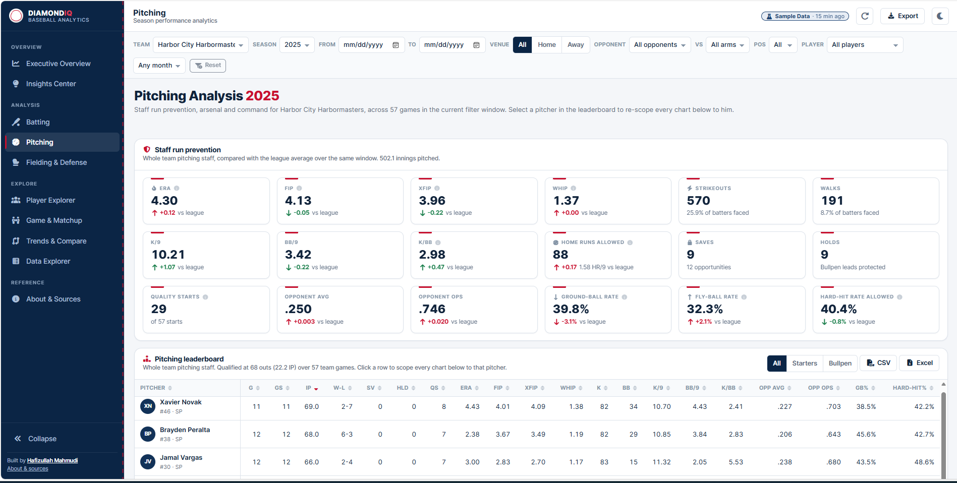
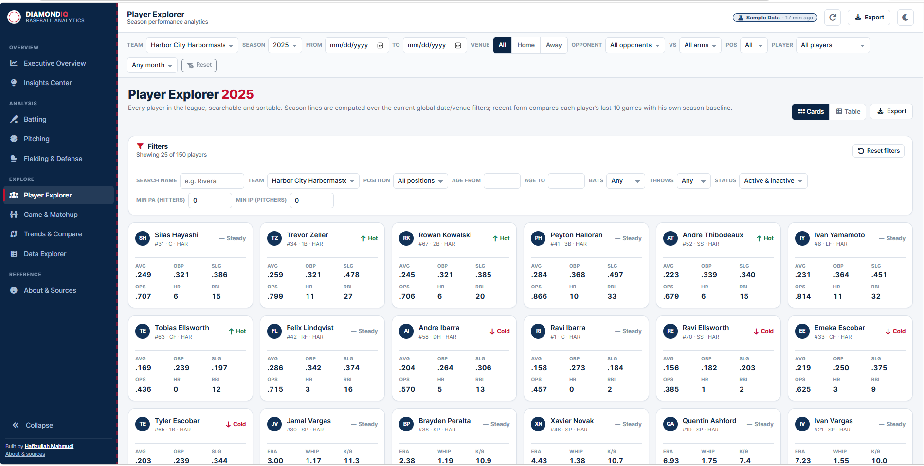
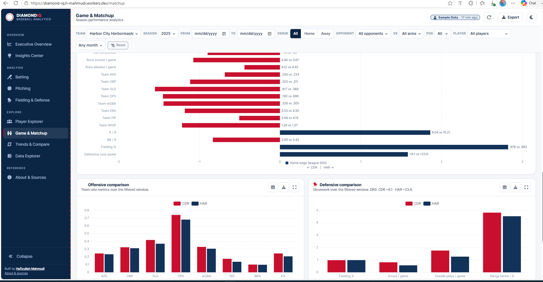
Summary
Final Thoughts
The hardest part of this project was not the visualisation — it was earning the right to be trusted. An analytics tool that quietly shows a zero where it means "unknown", or an insight that states a statistic nobody calculated, is worse than no tool at all.
Most of the engineering here goes into making that impossible: a metric layer where uncomputable values are structurally distinct from zero, a simulator where consistency is derived rather than maintained, and a test suite that treats an invented number as a build failure.