NBA Shot Analytics
Context
A four-page Power BI report on NBA shot-level data (~218,000 shots, 22 seasons), letting an analyst pick a team and player and interrogate where, when and how well they score.
The problem
The report had grown into two reports wearing one skin. The landing page was a fan-poster: a saturated orange canvas, photo cards, badges floating on top of the shot chart. The other three pages were stock grey dashboards. Nothing carried across — no shared header, no shared canvas, no shared title treatment.
Underneath the surface, the formatting had no system. The "theme" was eight arbitrary colours and four text classes; the real styling lived inside 46 individual visuals as 32 distinct hard-coded colour literals across three font families. Rebranding would have meant touching every file.
Three encodings were actively working against the reader:
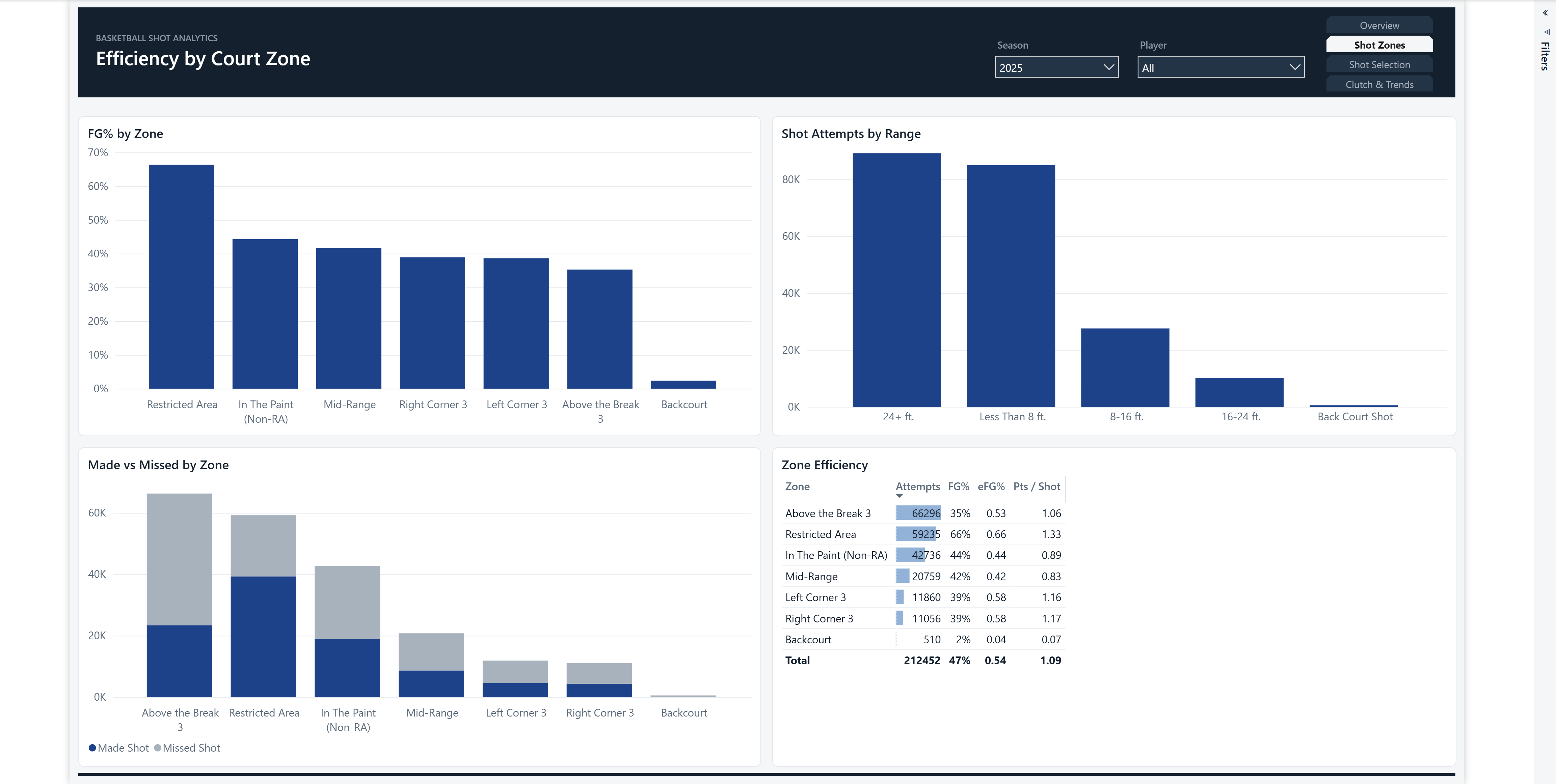
- Made vs Missed shots as green vs red — the textbook colourblind failure, on the one comparison the report exists to make.
- A blue→orange gradient across the FG%-by-zone bars, double-encoding what bar length already said.
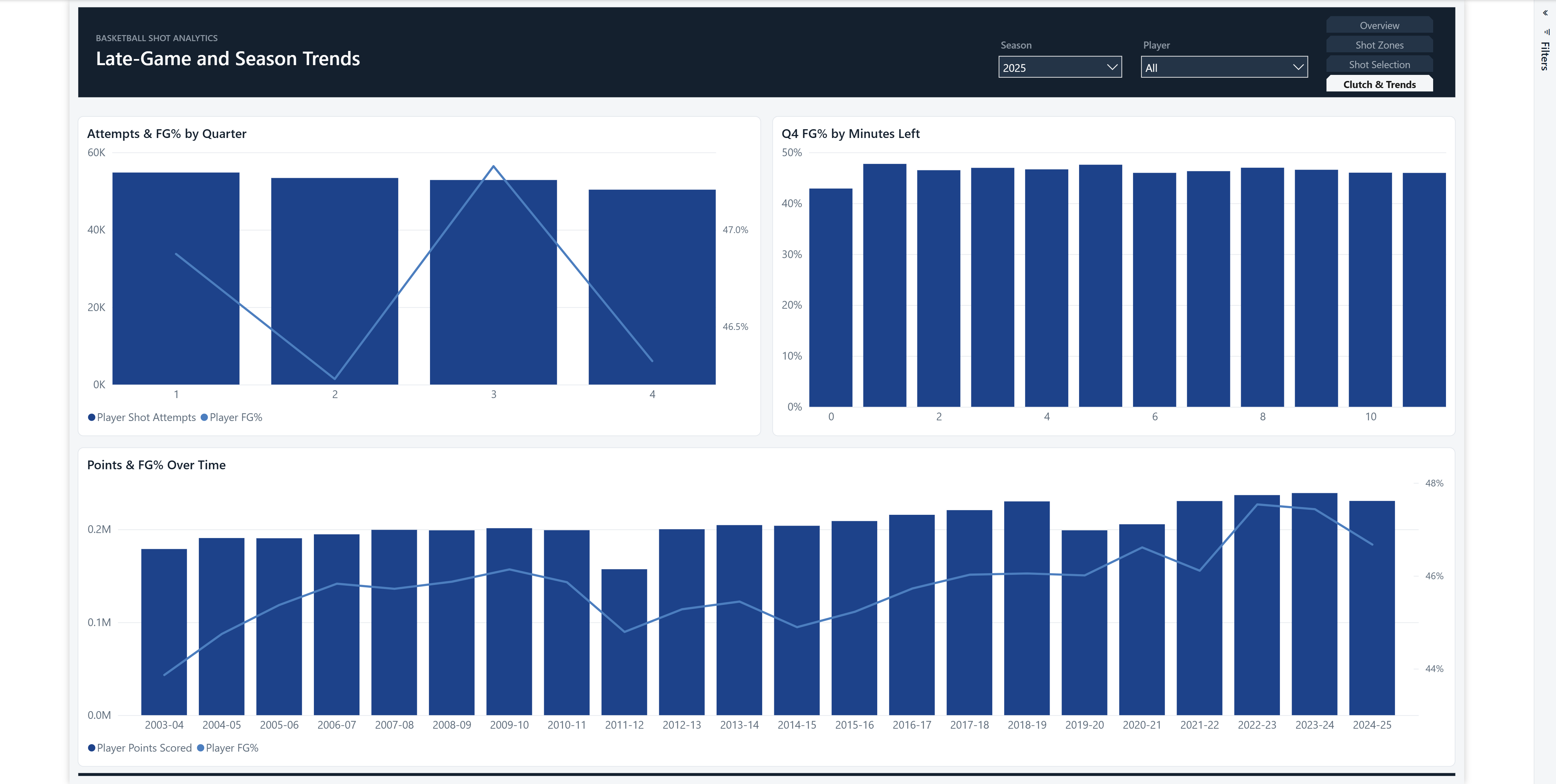
- A "Points & FG% Over Time" chart filtered by the Season slicer — so the trend chart designed to span 22 seasons rendered as a single bar. The page's headline insight was invisible.
Tools: Power BI (PBIP/PBIR), DAX, TMDL, pbir CLI
Approach
I committed to a design identity before touching layout, so every later decision had something to cite rather than being re-litigated per page:
- Tone: corporate. Predictable ink, two accents maximum.
- Signature: a dark header band on every page, carrying the title, page navigation and filters — plus a single-accent rule where navy carries all emphasis and everything else is neutral grey.
- Grid: 24px margin, 16px gutter, all positions computed arithmetically rather than dragged.
What I built
A real theme. Rebuilt from scratch: a colourblind-safe blue/orange palette (blue/orange rather than red/green for series), full structural colours, four text classes, a wildcard controlling card chrome and gridline weight, per-type overrides for nine visual types, and a styled filter pane. Formatting moved out of 46 visuals and into one file — a rebrand is now a single edit.
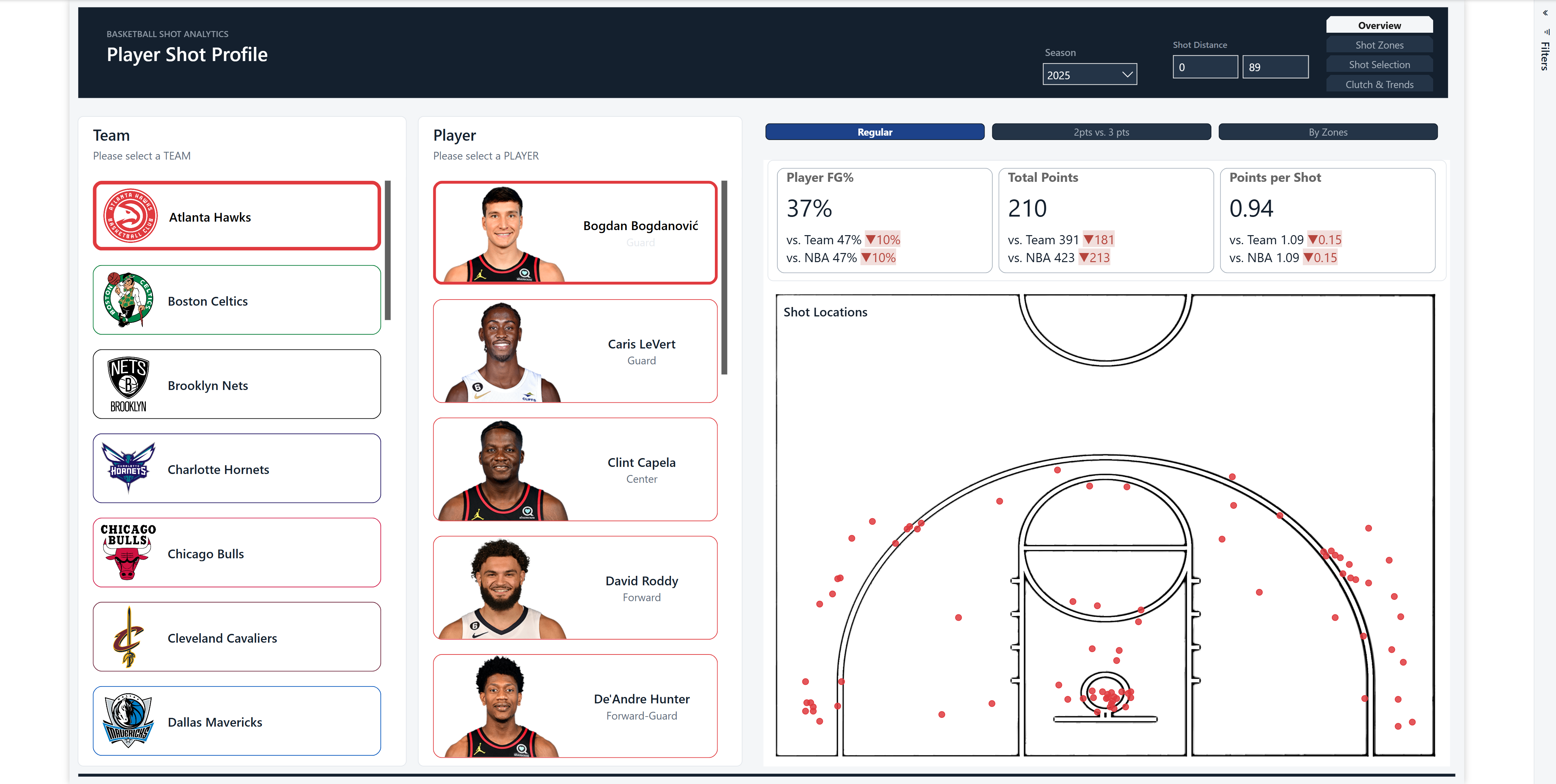
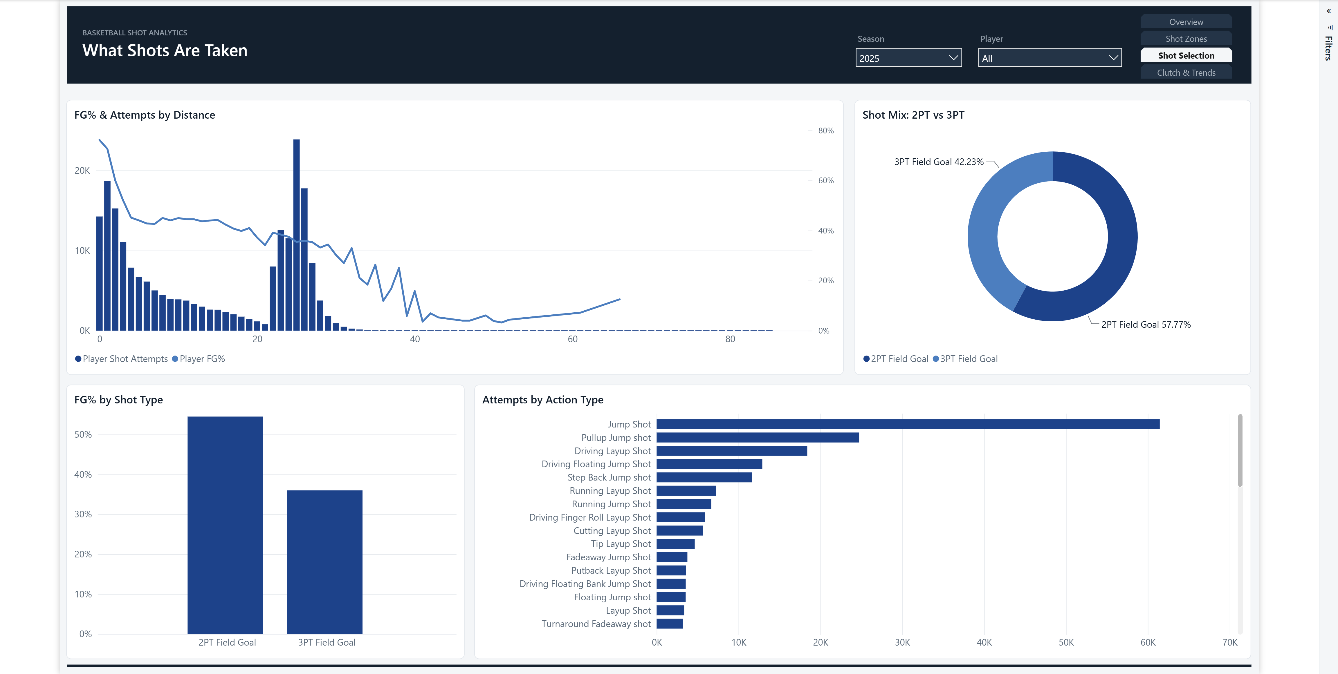
One identity across four pages. The orange canvas went; every page now sits on the same near-white canvas under the same header band, on the same grid.
Colour that encodes instead of decorates. Made/Missed became navy vs grey. The redundant gradient was removed in favour of sorted bars and a flat accent. The KPI delta chips — hardcoded Material pastels in DAX — were retuned to the theme's semantic tokens. I deliberately kept the real NBA team brand colours tinting the shot dots: that's genuine encoding, not drift.
Fixed the trend chart. Excluded it from the Season slicer via a visual interaction, restoring all 22 seasons and a legible efficiency trend.
Cut the decoration. Removed two badge cards floating over the shot chart — they displayed a count of non-null names, a meaningless number, while occluding the data.
Outcome
- Validation warnings down from 175 to 141; all slicer-clipping errors resolved.
- Report-wide formatting consolidated from 32 colour literals into a single governed theme.
- Every page passes the same design gate: one intent, equal spacing, on-grid, accessible colour.
Screenshots & Demos
Summary
What I'd call out
The most valuable fix wasn't cosmetic. The trend chart bug had been silently destroying the page's main insight, and no amount of restyling would have surfaced it — it only became visible once I rendered and looked at the report rather than reasoning about the JSON. Design review without seeing the artifact is guesswork.