Time Capsule • 1999
Power BI · Data storytelling · Year in review
1999:
A Time Capsule
An eight-page year-in-review that reads like a magazine and behaves like a Power BI report—assembled from public archives, set in a fixed design system, and told one chapter at a time.
What it is
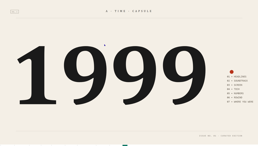
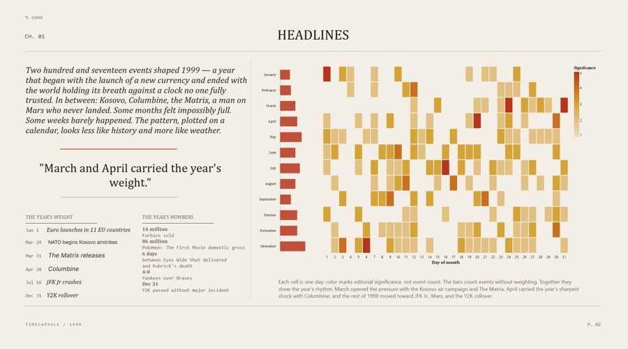
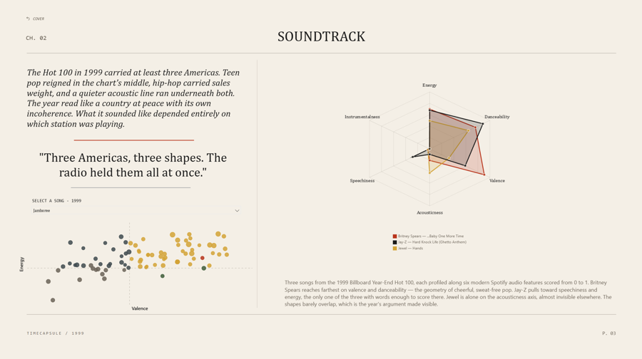
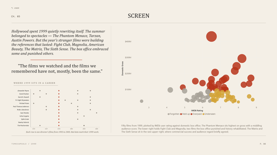
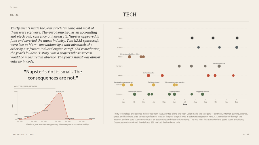
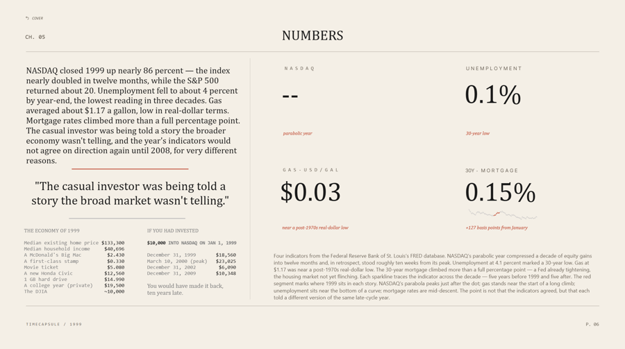
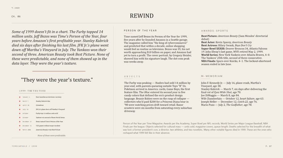
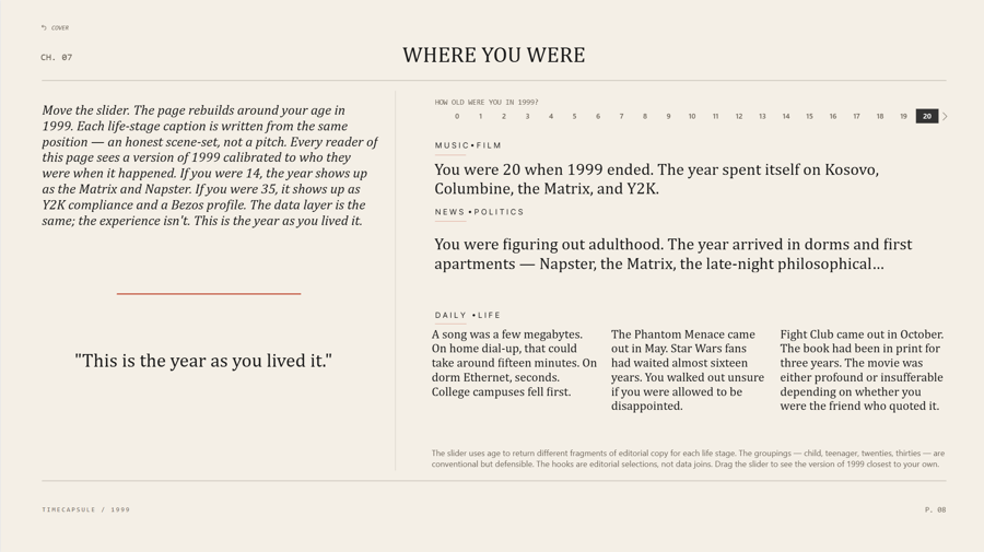
Eight report pages covering one year: Cover, Headlines, Soundtrack, Screen, Tech, Numbers, Rewind, and Where You Were. Each chapter carries one chart and the editorial copy that explains it, styled after print year-in-review issues rather than a conventional dashboard.
The data comes from Wikipedia, Billboard's year-end Hot 100, Box Office Mojo, the OMDb API, eight Federal Reserve series, and a Spotify audio-features dataset. Python scripts handle acquisition and cleaning; Power BI handles the model, visuals, and layout. The judgment—which events matter, which songs stand in for a hundred, and which chart shape makes the point—is documented rather than implied.
By the numbers
The pages
Judgment calls
NASDAQ substituted for the S&P 500
FRED's SP500 series only reaches back to 2013, so a 1990s window returns an empty chart rather than an error. The NASDAQ Composite is also the sharper instrument for a dot-com issue: up about 86% in 1999 and peaking ten weeks later. The substitution is recorded in the project brief so every measure names the NASDAQ rather than implying the S&P.
Films the calendar year hid
Box Office Mojo groups films by calendar-year gross, dropping Magnolia, The Hurricane, and The Cider House Rules—December limited releases that earned in 2000—out of 1999 entirely. A second OMDb pass restores them. The four additions that survived deduplication carry Source = "OMDb-supplemental" and Rank = 999, so an editorial addition cannot pass as a chart position.
Significance over count
Counting events makes a crowded news week and a consequential one look identical. Each headline therefore carries a weight from 2 to 5. Color encodes weight, bars encode count, and the caption states which is which.
A scraper that had to change shape
Wikipedia's twelve month pages for 1999 all soft-redirect to the year article, so the intended scrape returned the same page twelve times. The fix was to fetch the year article once for 88 anchor events, walk all 366 day-of-year pages for the remaining 135, and merge at 0.85 title similarity.
Pipeline
| Script | Source | Output | Rows |
|---|---|---|---|
01_scrape_headlines.py |
Wikipedia — 1999 year article | Year-overview events | 88 |
01b_scrape_per_day.py |
Wikipedia — 366 day-of-year articles | Per-day events | 135 |
01c_merge_headlines.py |
Both headline sources | headlines.csv |
217 |
02_billboard_and_spotify.py |
Billboard Hot 100 · Spotify features | music.csv |
100 |
03_movies.py |
Box Office Mojo · OMDb API | movies.csv |
84 |
04_fred.py |
FRED — eight series | economy.csv |
7,118 |
05_song_dna.py |
music.csv |
song_dna.csv |
18 |
| Hand-curated | Wikipedia references, per event | tech.csv · directors_decade.csv · napster_milestones.csv |
30 · 38 · 8 |
Row counts reflect the tables in processed/. Source files remain immutable in raw/, API keys stay in .env, and Power BI imports the CSVs without performing any scraping.
Built with
- Python 3.12 — pandas, requests, BeautifulSoup, rapidfuzz, and fredapi
- Power BI Desktop —
theme.json, SVG page backgrounds, bookmarks, and a what-if parameter - Deneb (Vega-Lite) — calendar heatmap, radar chart, timeline, and sparklines
- Design system — paper
#F4EFE6, ink#1A1A1A, oxide#B8341B, gold#D4A437; Cambria, Segoe UI, and Consolas
Sources
- Wikipedia — year, day-of-year, and Billboard year-end articles (CC BY-SA 4.0)
- Box Office Mojo (IMDb) — 1999 domestic box office
- OMDb API — per-title enrichment
- Federal Reserve Economic Data (FRED), Federal Reserve Bank of St. Louis
- Audio features courtesy of Spotify, via Kaggle
1999: A Time Capsule · Power BI editorial data story